Stoney Clover Lane
Stoney Clover is all about embracing your personality and not being afraid to show it. Founders Kendall and Libby wanted to create a stylish brand that inspired how they travel, pack, and accessorize for whatever mood they are in, whether that is chic, simple or vibrant. Taking inspiration from our 90s holographic sticker book and celebrating color, femininity and fun, Stoney Clover’s brand tells a story of the grown-up millennial girl living a modern lifestyle.
Branding/Identity Packaging Copy Writing


Everyone’s invited
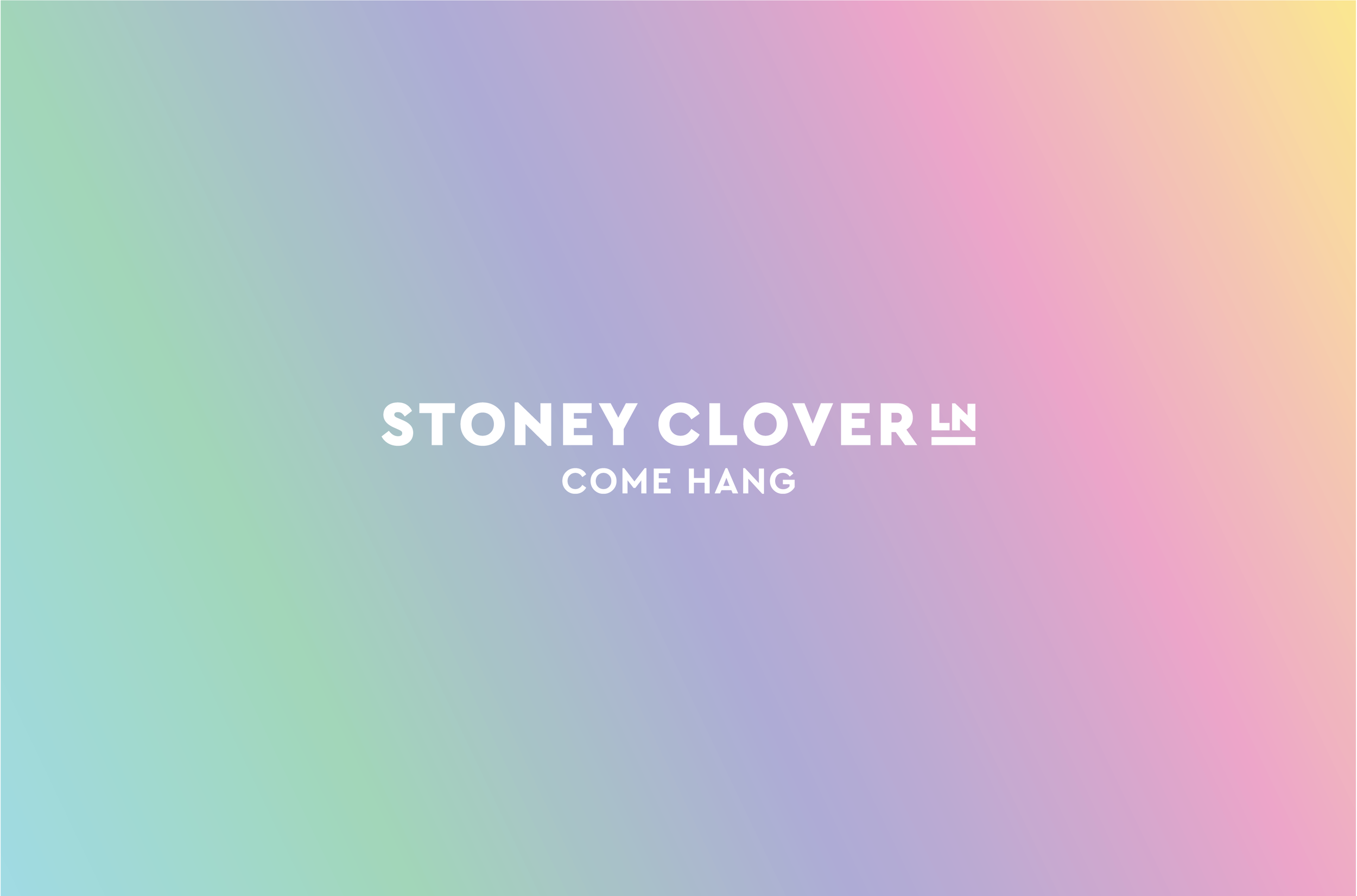
Stoney Clover's visual identity communicates their happy-go-lucky, all inclusive spirit. They are not afraid of color and being themselves, and they want everyone to feel welcome. We chose a clean geometric typeface with an inviting presence and a modern touch to balance the bright color scheme.
Custom Illustrations
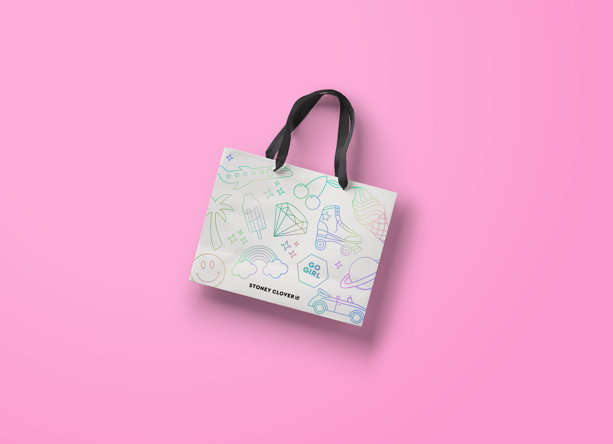
Stoney Clover’s custom illustration set represents the inner child in all of us. The icons are pure fun with a monoline weight carrying a grown up feel. The gradient idea is seen throughout the iconography but used sparingly. We used Stoney Clovers accessories, including stickers and patches, to dictate the icon content.

A brand that’s your best friend.
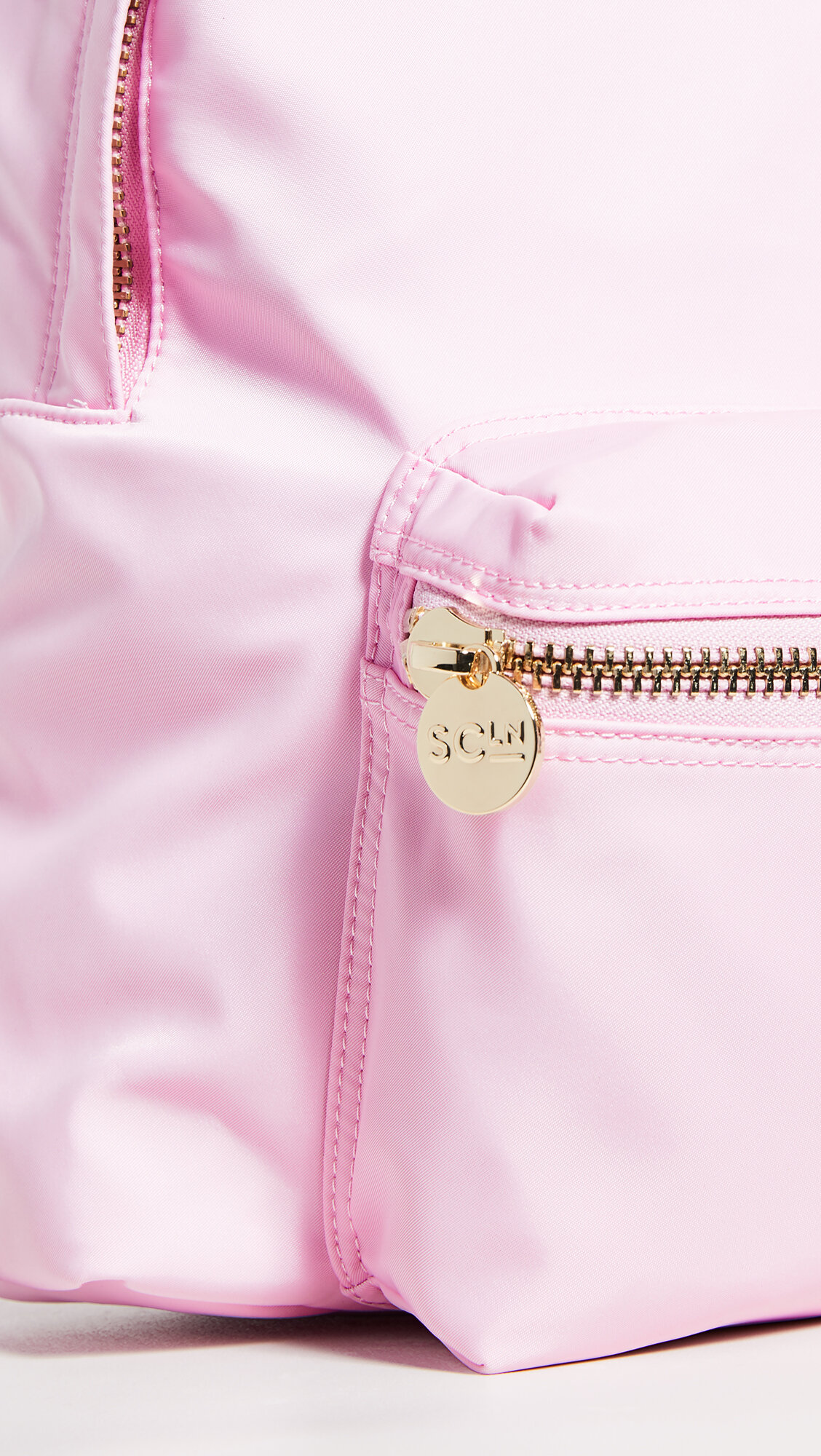
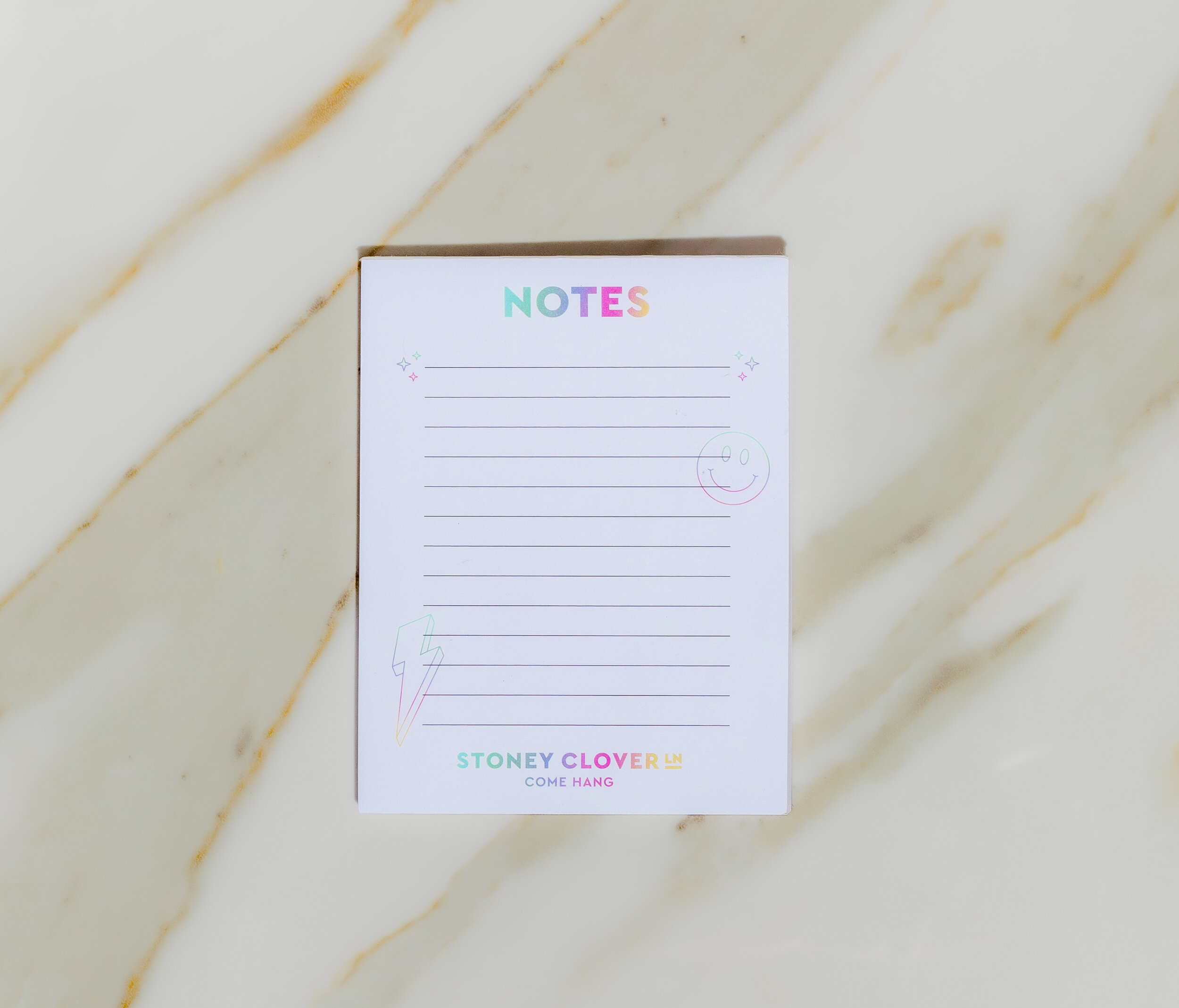
Stoney Clover Lane embraces your creativity to customize and make it yours! The brand’s name is taken from the founder's childhood street, so naturally we decided to design the letters to emulate a street sign. We wanted to exaggerate the brand icons on collateral pieces to reflect the company’s sense of pure joy, playful energy and self-loving perspective. You do you girl!

Project Credits
Made at Paperwhite Studio
Art direction: Laureen Moyal
Senior Designer: Julie Salzman
Photographer: Jacob Williamson


